One of the primary reasons I started this blog was to provide a more objective view of the
Portland real estate market.
Some, if not most of the data and statistics the NAR publishes are misleading, if not bordering on misrepresentation.
For example, their measure of days on the market is meaningless, because listings can and ARE regularly canceled and re-listed with a new number, starting the counter over again.
While I don’t expect the NAR to change their policies anytime soon, at least I can show a more realistic picture to help both buyers and sellers better understand the market so that sellers can get their home sold quickly and buyers can find their dream house – both at the right price.
A friend of this blog - who wishes to remain anonymous - has provided the following data and charts of the greater
Portland real estate market.
I will be updating this data monthly as well as adding new sources and analysis as I go along. So here goes.
 The median home price in Portland (chart 1) peaked in August 2007 at $300k and has since dropped 6.6% to $280k in January 2008. Year over year prices are still up 1.8% (chart 2) in January but chart 1 clearly shows a downward trend.
 Chart 2 shows the year over year (YoY) price appreciation. The forecast in chart 2 is based on the assumption that the median price stays flat at $280k. If the median price drops, the YoY change will drop further. But within a few months we'll be showing negative YoY appreciation, finally catching up to the rest of the country.
 Chart 3 shows the rate of sales (sales pace) as well as the total inventory of houses. You can clearly see inventory rising while sales have dropped and the drop appears to be accelerating. Divide inventory by sales rate and you get months of sales, which currently stands at 12.8 months. In other words, if no new houses are listed, it would take over a year for all the inventory to be sold at the current sales rate.
 Chart 4 shows affordability in Portland. Anything less than 0 means that the median house is not affordable by the buyer with median income. The chart shows that in August 2007 median affordability peaked around -$50k, but the combination of lower median prices and lower interest rates has helped affordability. Unfortunately in February interest rates increased significantly so I expect the trend to reverse unless median prices fall significantly.

Chart 5 shows the spread between median list price and median sales price, or the “balance of reality” indicator. The drop around July 07 is due to buyers having to reduce their asking prices to find sellers as the market started to soften.
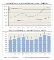 Chart 6 shows the spread of rents to mortgages. In 2002-2003 we were below the historic average, but in the past few years the spread has accelerated. Even though rents have risen recently, they haven’t risen as fast as the median mortgage payment. I expect rents to continue to increase as mortgages drop, closing the gap over the next 1-2 years. Historically the spread has ranged around 140%, and even with the recent increases in rents we're still 30% over the long term average. Expect rents to continue to increase due to apartments being converted into condos, and because more people will not be able to afford houses and will therefore be looking to rent.
Stay tuned for February data, which is already shaping up to be even worse.
EDIT: I've reduced the size of the charts, so they are readable when you click on them to make them larger.
 Overall inventory is up in Feb to 14,870 units, from 14,131 in Jan. More importantly, inventory is up 40% year over year, the same as in January. So no signs of inventory dropping.
 Combine sales and inventory and you get months of inventory, which dropped from 12.8 months in January, to 10.8 months in February. Year over year months of inventory have more than doubled from Feb 07, up 102.8% in Feb 08.
 So even though sales are down and inventory is up, the median price has managed to hold steady at $280k, up 0.7% from Feb 07. The market peaked in August 2007 at $300k, so today's price is down 7% from the peak.
 In the last chart, if we assume prices remain flat at $280k, then by July we will see -7% Year over Year appreciation.


