The March RMLS data was released this week and it's not as bad as I expected. A big thank you goes out to Chris at Johnson Gardner for help with the analysis. I thought I was a good analyst, but Chris is better. Click on any of the chart to enlarge them. On to the charts!


The median price in March was basically flat, up only 0.6% Year over Year, and up 2.7% from February. Year over year growth has basically been flat for three months now.

Inventory as measured by the absolute number of homes on the market rose again in March for the third straight month, nearing 15,900 units. So while inventory in terms of months has fallen since January as a result of a more accelerated (seasonal) sales pace, the total number of sellers on the market has increased. In other words, the rate of sales in the first quarter has yet to keep pace with new additions to the market. The rate of sales is down 39.1%, and I believe that the lack of buyers will eventually drive down prices.

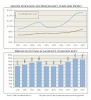
The affordability measure in the metro area fell in March for the second straight month. This was partially the impact of a monthly increase and median prices [$280,000 in (Feb 08) vs. $286,500 (Mar 08] and a slight uptick in the average 30-year FRM.

The results of this figure are deceiving. This chart calculates the spread of listing to sales prices in an attempt to measure seller optimism (or reality). While the results for March indicate a narrowing spread, this was the result of a higher sales price and stagnate listing prices. This would indicate that on average--at least in March, that buyers came back to the sellers in terms of price and not vice versa.
Chris also added a couple cool new charts and some more detailed analysis this month.

This is a cool visual that scatter plots all sales under $1,000,000 by price and sq. ft. The trendlines would indicate that prices have in fact remained roughly consistent year over year.

This chart shows the distribution of sales by price cohort. Using $300,000 as a benchmark there was a slight 1.1% shift toward higher priced homes (Above $300,000) obviously accounting for the modest uptick in median price.

This chart displays the year-over-year change in sales pace by price point. This chart allows us to measure which cohorts of the market are seeing the biggest slowdown. The 56% decrease in homes below $150,000, and to a certain extent $200,000 to $300,000 is an indication of marginal or first time buyers either waiting it out or failing to get financing.

A summary of market activity by product type. (Note from Chris: Note that RMLS issued a section on condo appreciation that listed an average condo sales price of $336,500 for March 2008. I am fairly certain this is a miscalculation). Not how the average sales price in the market is no longer increasing. In my opinion this would suggest that tightening in terms of pricing is starting to occur.
This data differs from the data reported in the RMLS Market Action. The RMLS likes to report the last 12 months vs the previous 12 months, and based on this methodology it appears that the average price is still increasing. I believe our method here is more accurate, and more clearly shows changes in growth, both up or down.

It shows inventory in terms of months (using the Realtors calculation) by price point. Good luck selling your $600,000+ home.

This chart shows median sales price and sales pace by subregion. Next month we'll get to year over year changes.
Again a big thanks to Chris for all this analysis.


